2022
REbranding for tech solutions company
#branding #logotype #webdesign #print #socials #visualguidelines #Figma
The client:
Navitas is the US-based B2B technology solutions company, that helps organizations deliver a positive impact on communities by offering cloud, cybersecurity, data analytics, AI, advisory, and migration services.
The challenge:
Develop a clear and engaging brand identity that effectively communicates the company's technological expertise and human-centric approach, including website assets, brand guidelines, and marketing collateral.
The solution:
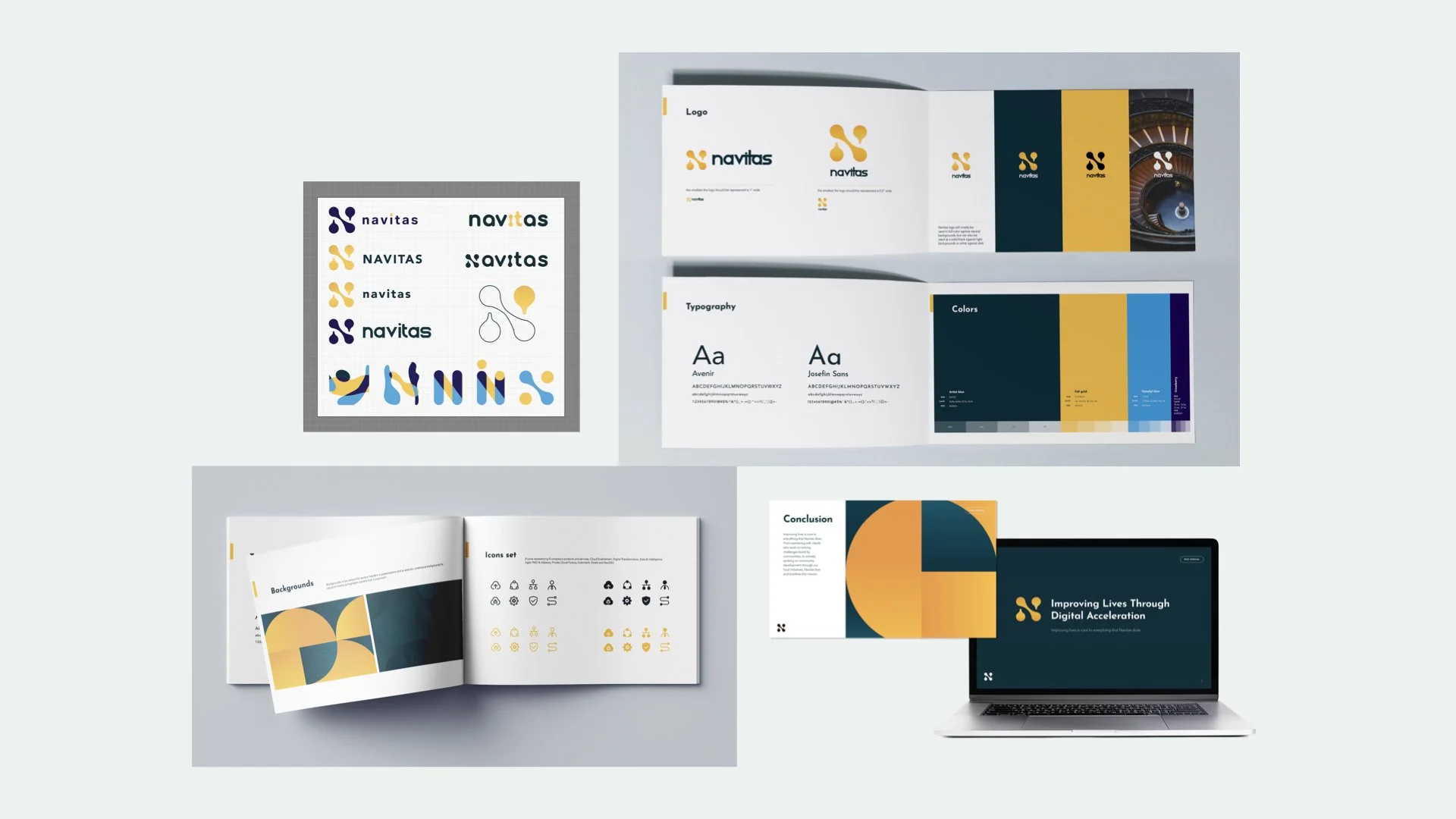
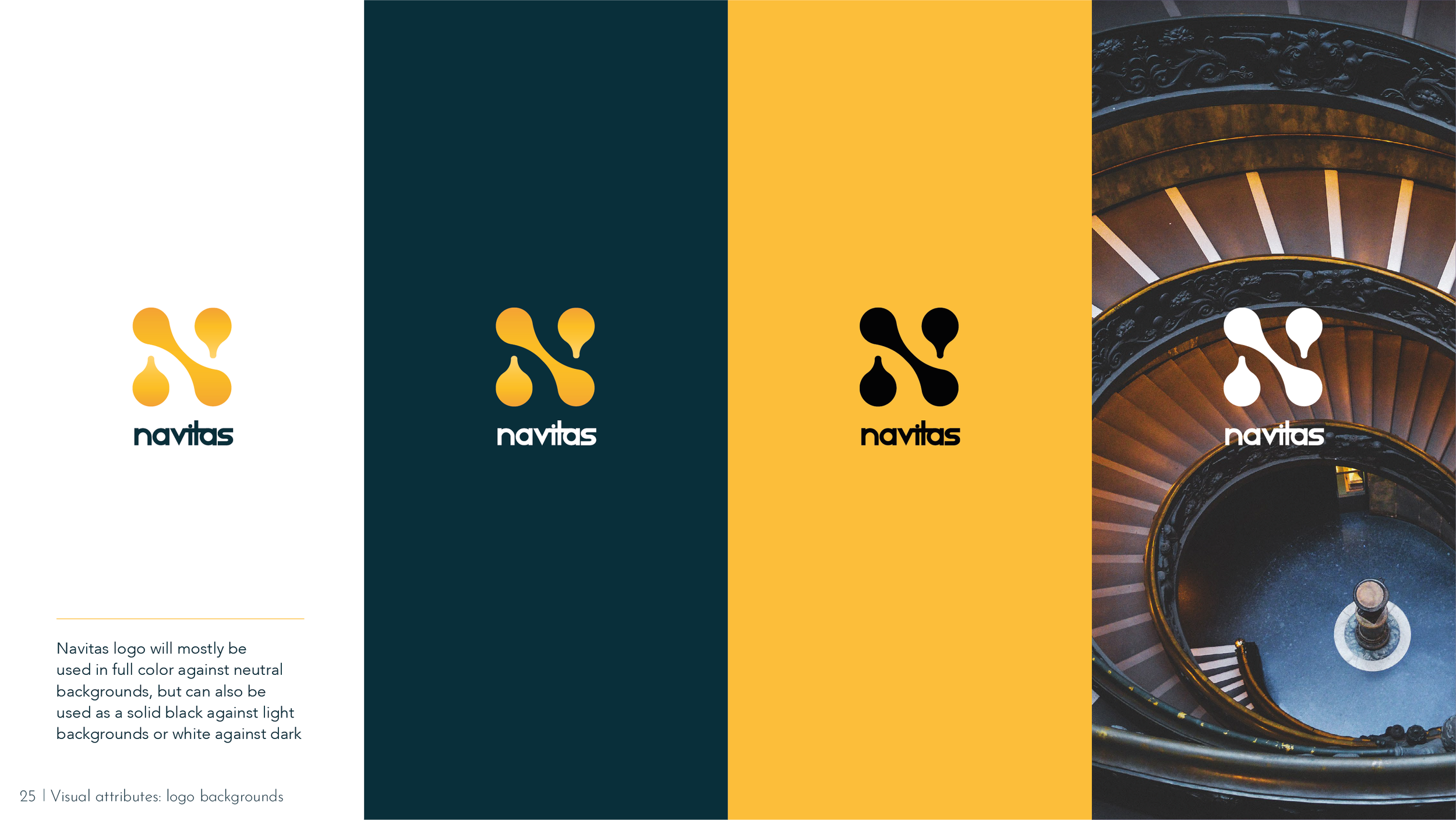
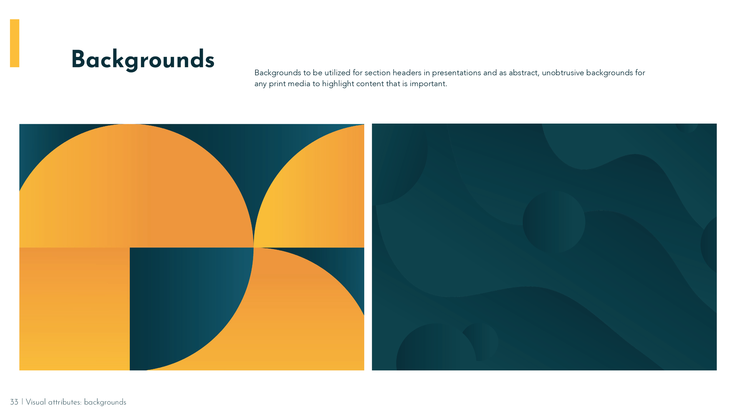
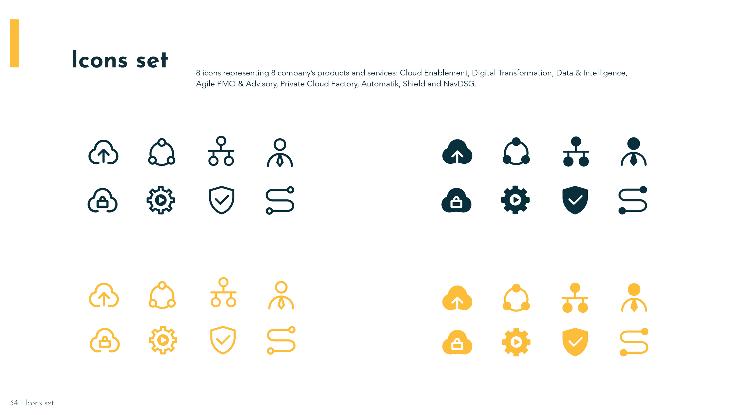
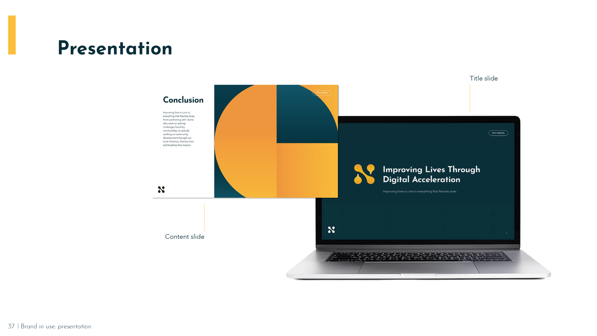
The concepts of connection, unity, and energy were the main inspiration for the logo icon and other visuals. The primary colors, blue and yellow, symbolize the blend of technology and communities. To maintain brand recognition and minimize drastic changes, the logo font was kept unchanged.
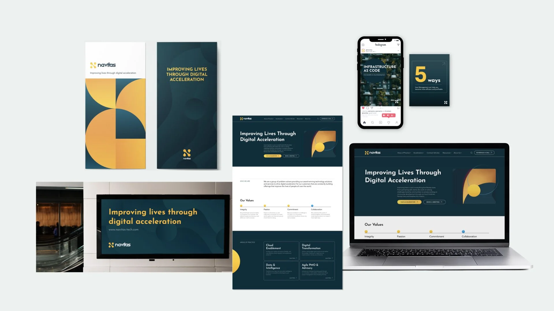
The website development & process in Figma


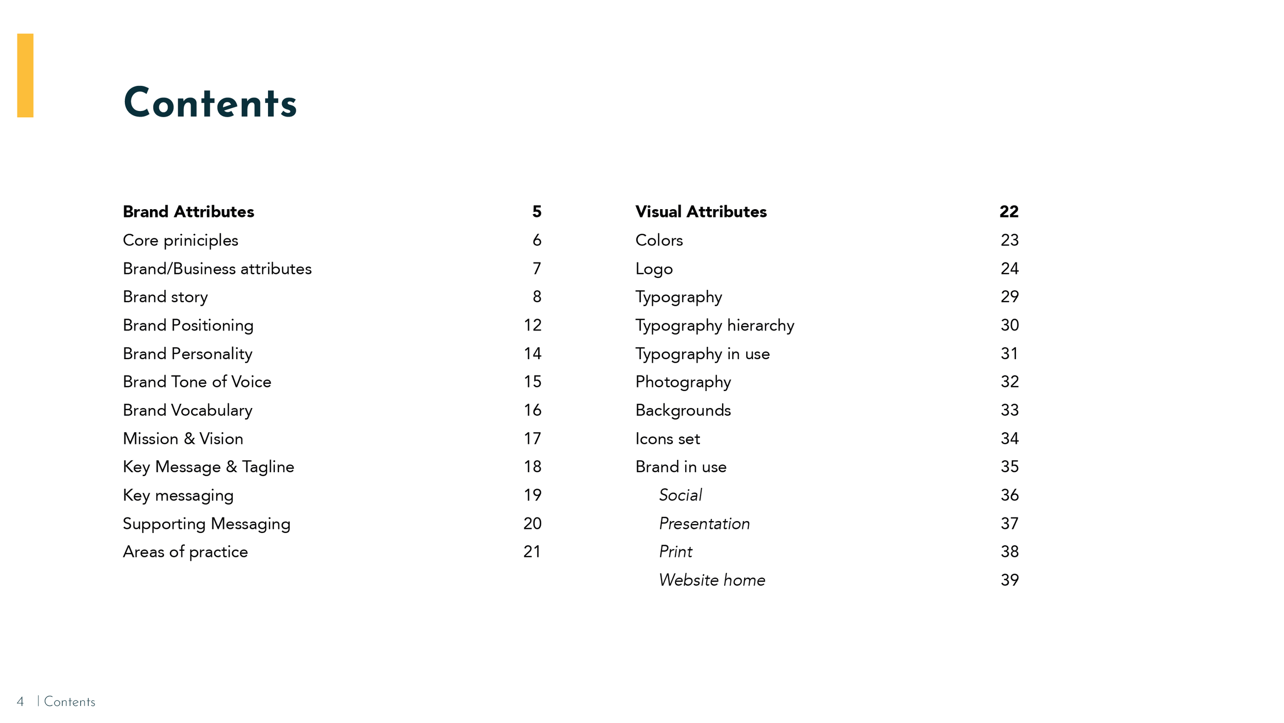
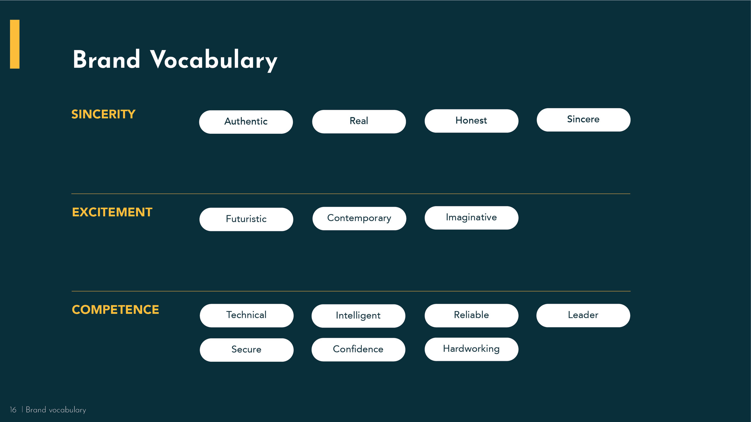
brand guidelines


navitas #irl


